I worked as a graphic designer to help develop and expand an identity system for the 10th Annual Typographics Festival, a design festival "for people who use type" held at The Cooper Union.
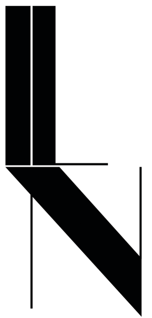
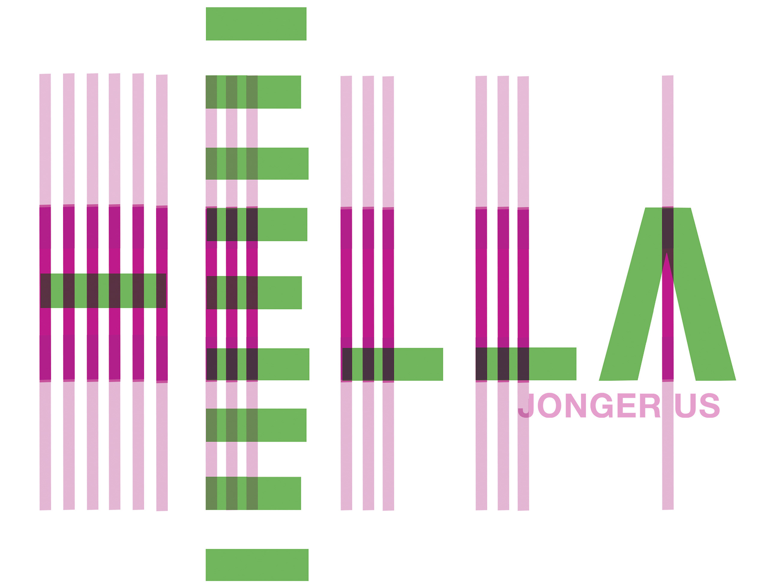
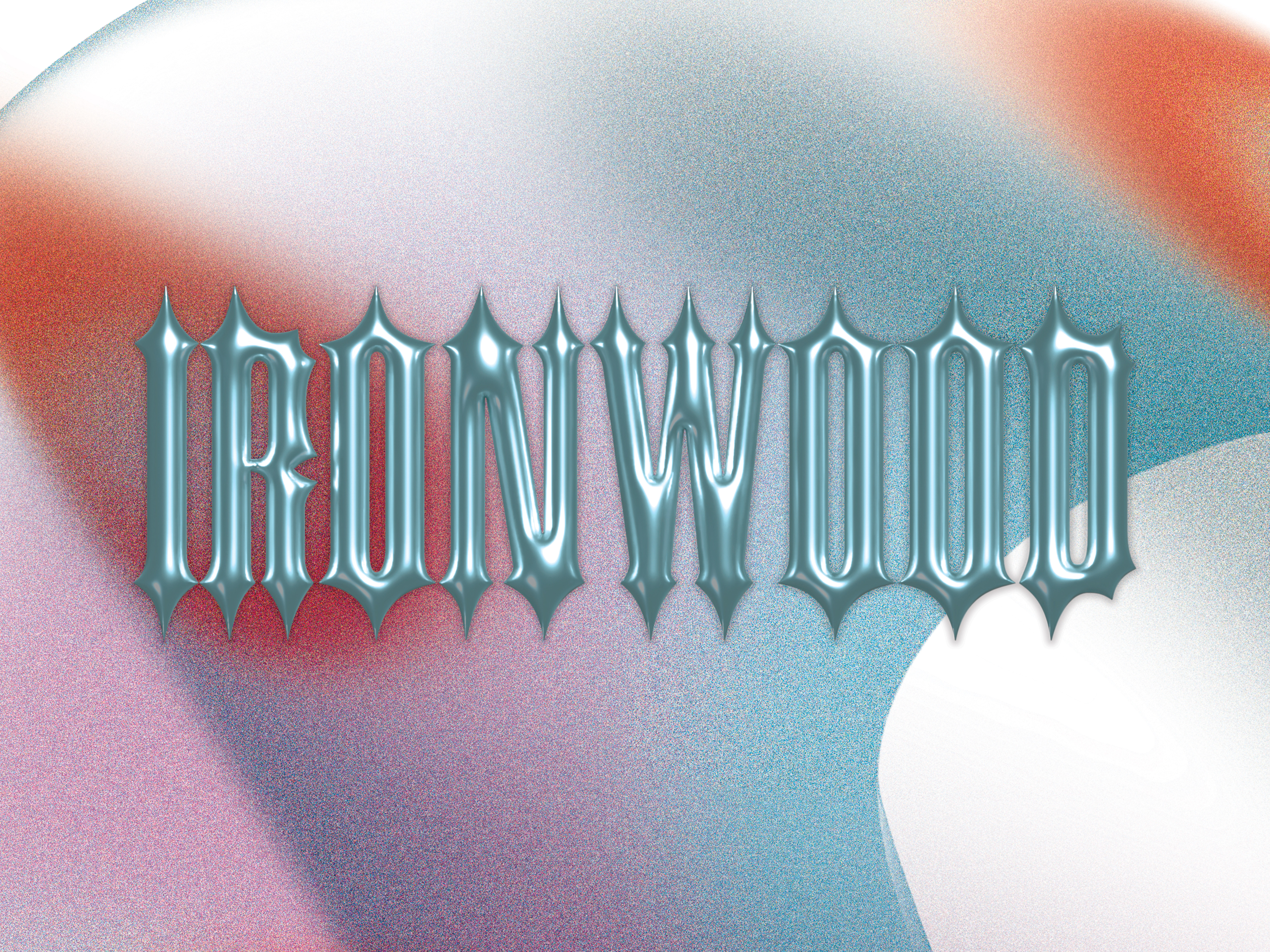
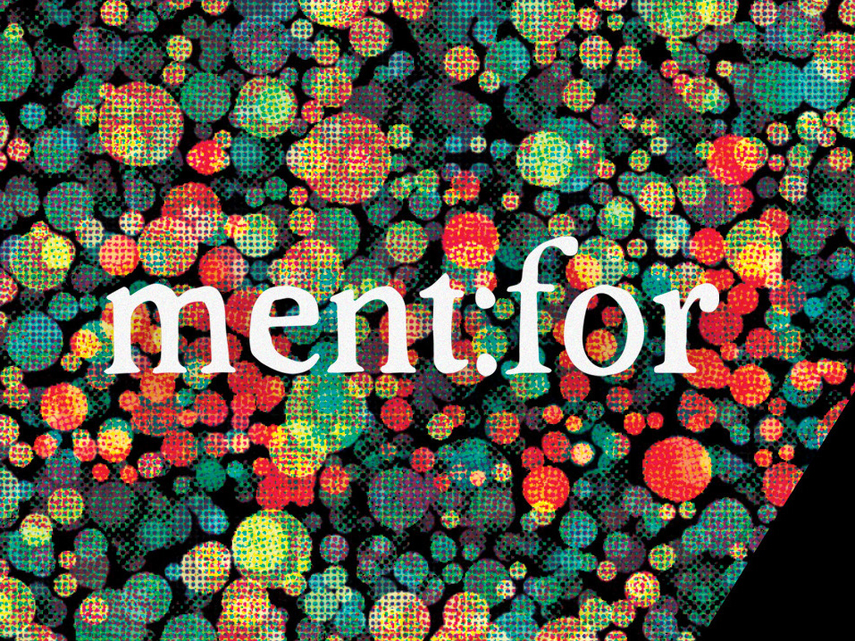
The identity is incredibly adaptable; the bold hues and rhythmic typographic compositions allow for it to move seamlessly from varying levels of chaos and clarity. Utilizing the many variations in our chosen type family "Boogy Brut", the resulting system is a chameleon in its ability to tailor to the multiple events Typographics encompasses. From the main conference to featured workshops to the book fair, the identity is able to hit a wide range of visual tones, while maintaining an overall recognizable and contemporary identity.
TEAM: Nick Sherman, Zrinka Buljubasic, Jess Kuronen, Lily Nguyen, Elwing Gao, Gen Ramierz
Photography: Lily Nguyen
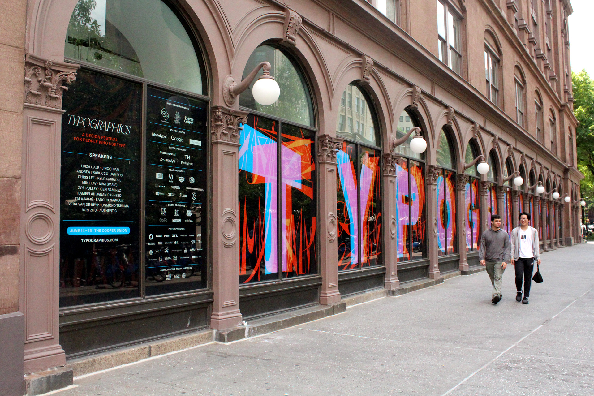
Colonnade Window Design: Gen Ramirez and Lily Nguyen
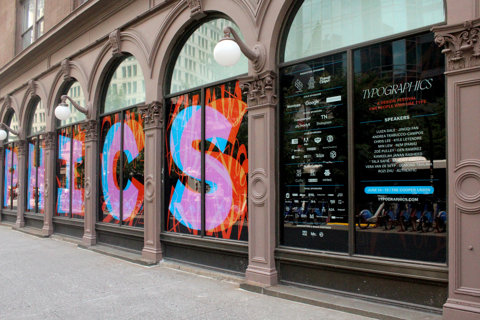
Colonnade Window Design: Gen Ramirez and Lily Nguyen
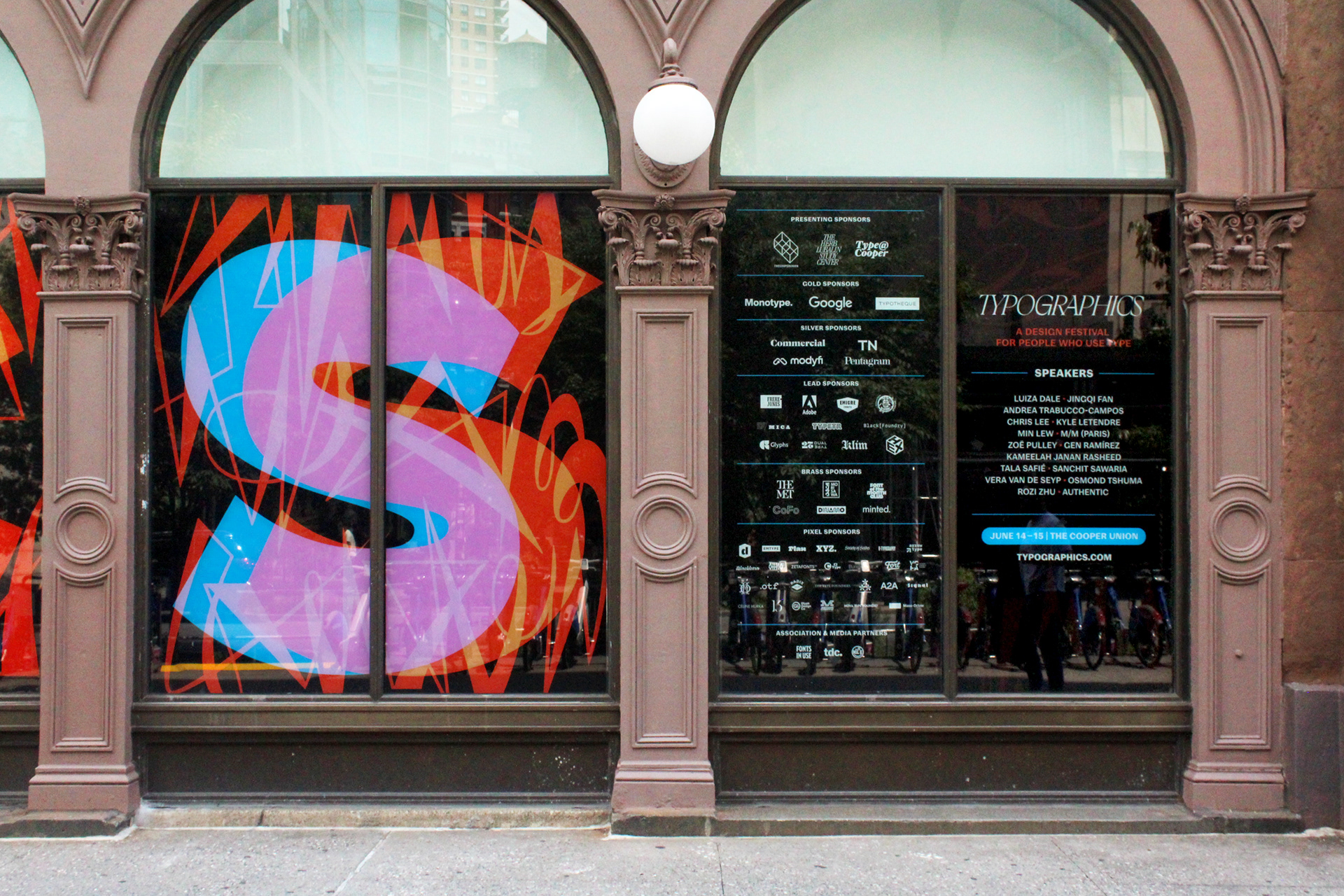
Colonnade Window Design: Gen Ramirez and Lily Nguyen
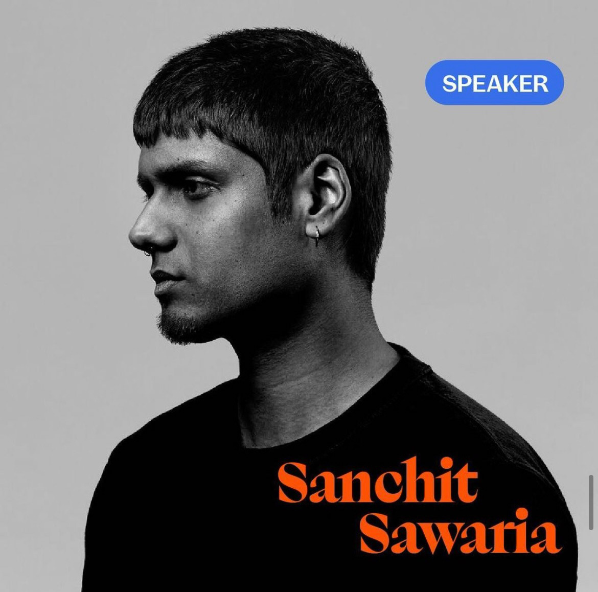
Social Media Assets: Lily Nguyen and Elwing Gao
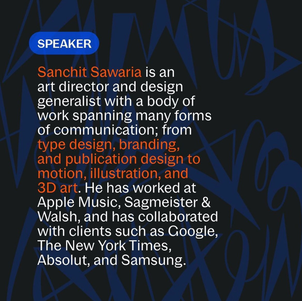
Social Media Assets: Lily Nguyen and Elwing Gao
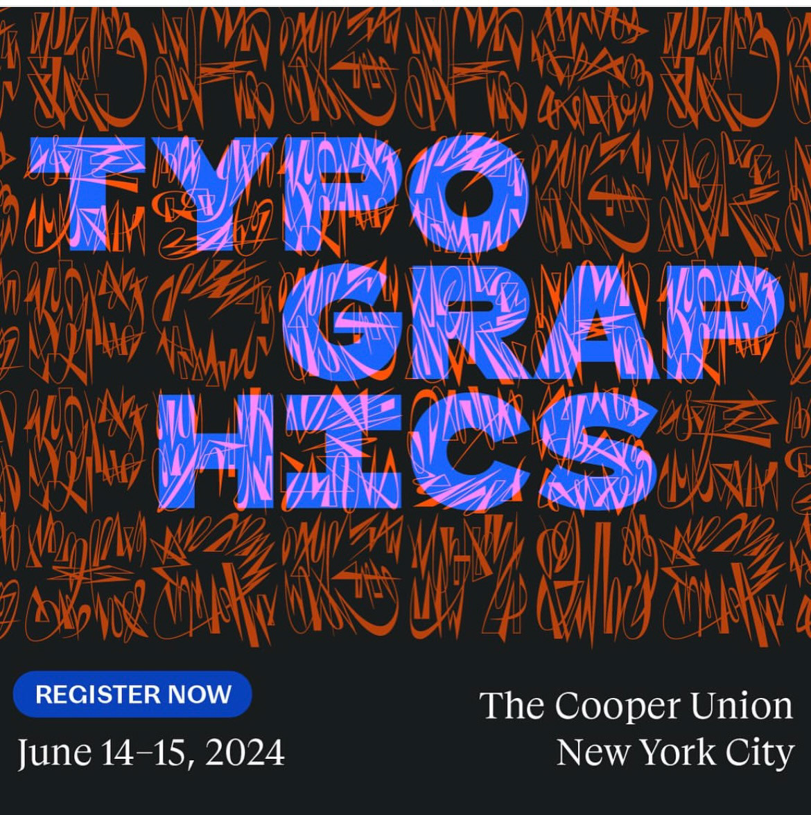
Social Media Assets: Lily Nguyen and Elwing Gao
TYPOGRAPHICS BOOK FAIR
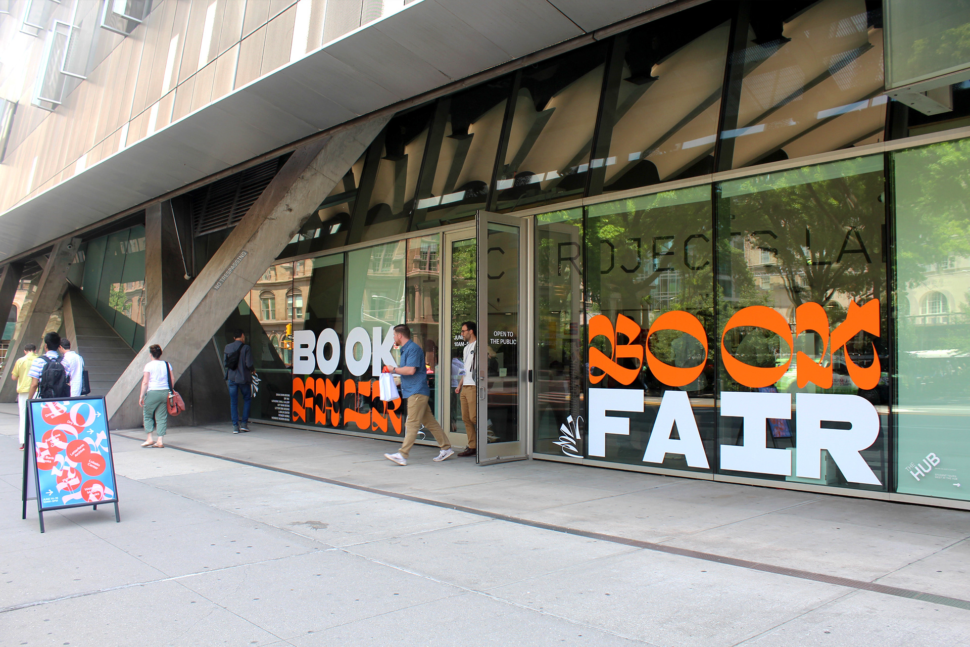
I had the opportunity to expand our identity into a large-scale vinyl piece for the Typographics Book Fair.
Utilizing the concept of a ying-yang, the combination of san and san-serif letterforms create a seamless blend of these fun embellished moments juxtaposed by more traditional moments. The resulting piece is design forward, while simultaneously approachable and legible.
This vinyl piece uses “guerilla-style marketing”, in which everyday passerbyers were struck by the electric, abstract typeface and beckoned inside. Using vivid colors and 3' by 3' letters that could be spotted from blocks away, this piece creates a visually engaging experience for anyone who encounters it.
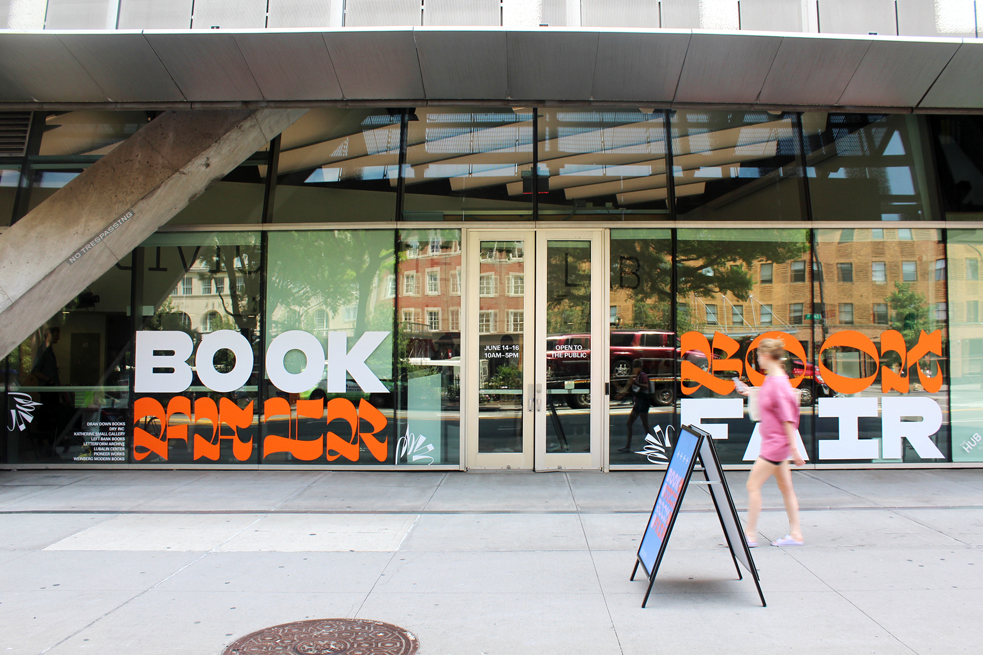
Typographics Book Fair | Design, Production, and Instillation: Lily Nguyen
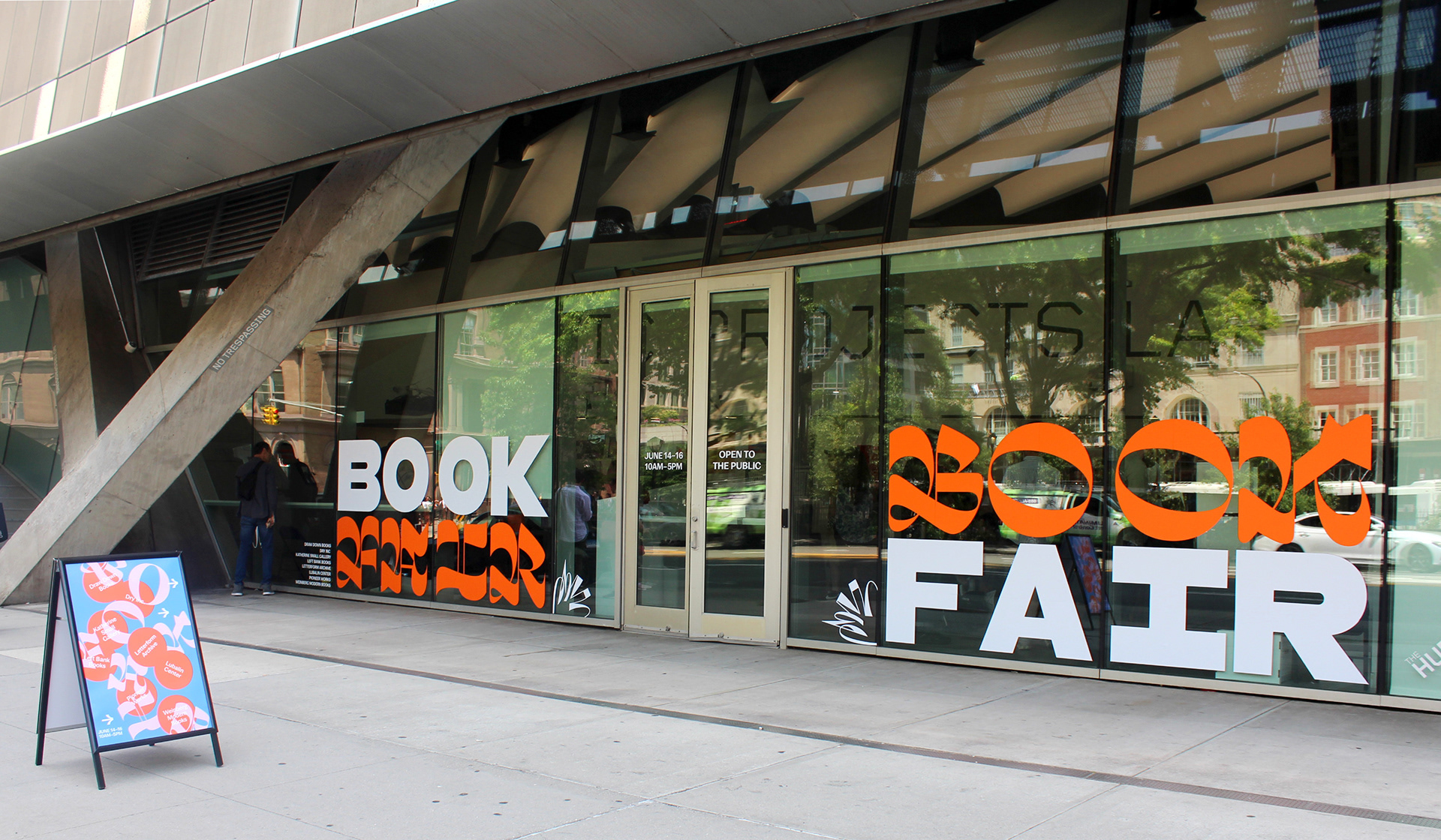
Design, Production, and Instillation: Lily Nguyen
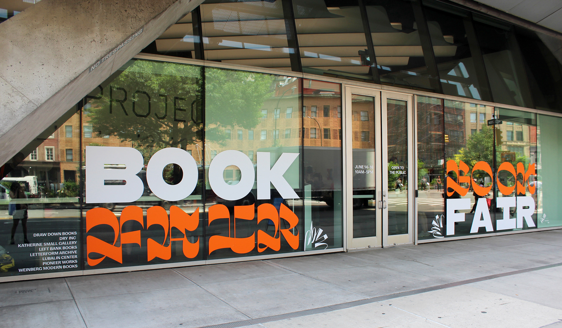
Design, Production, and Instillation: Lily Nguyen
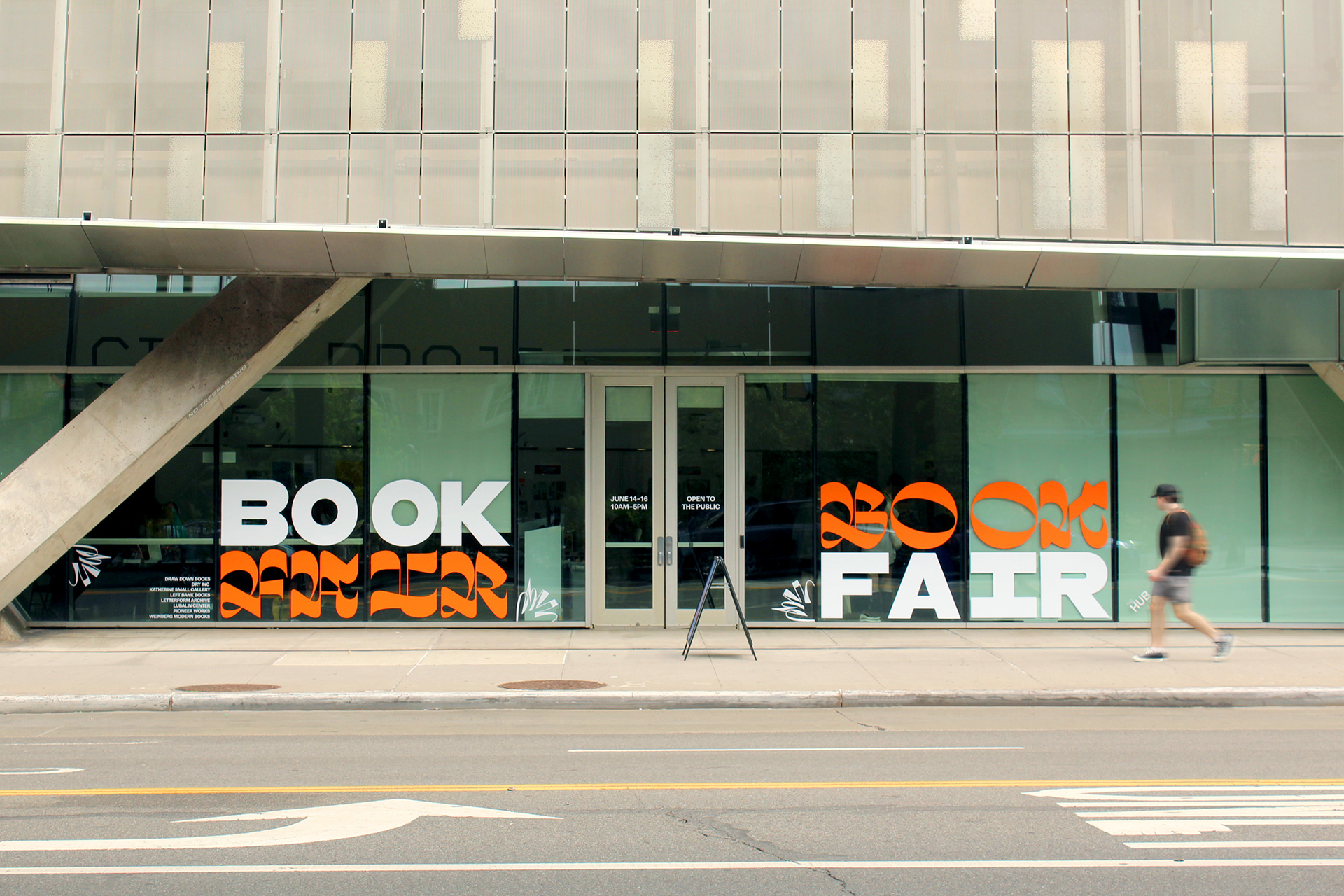
Design, Production, and Instillation: Lily Nguyen
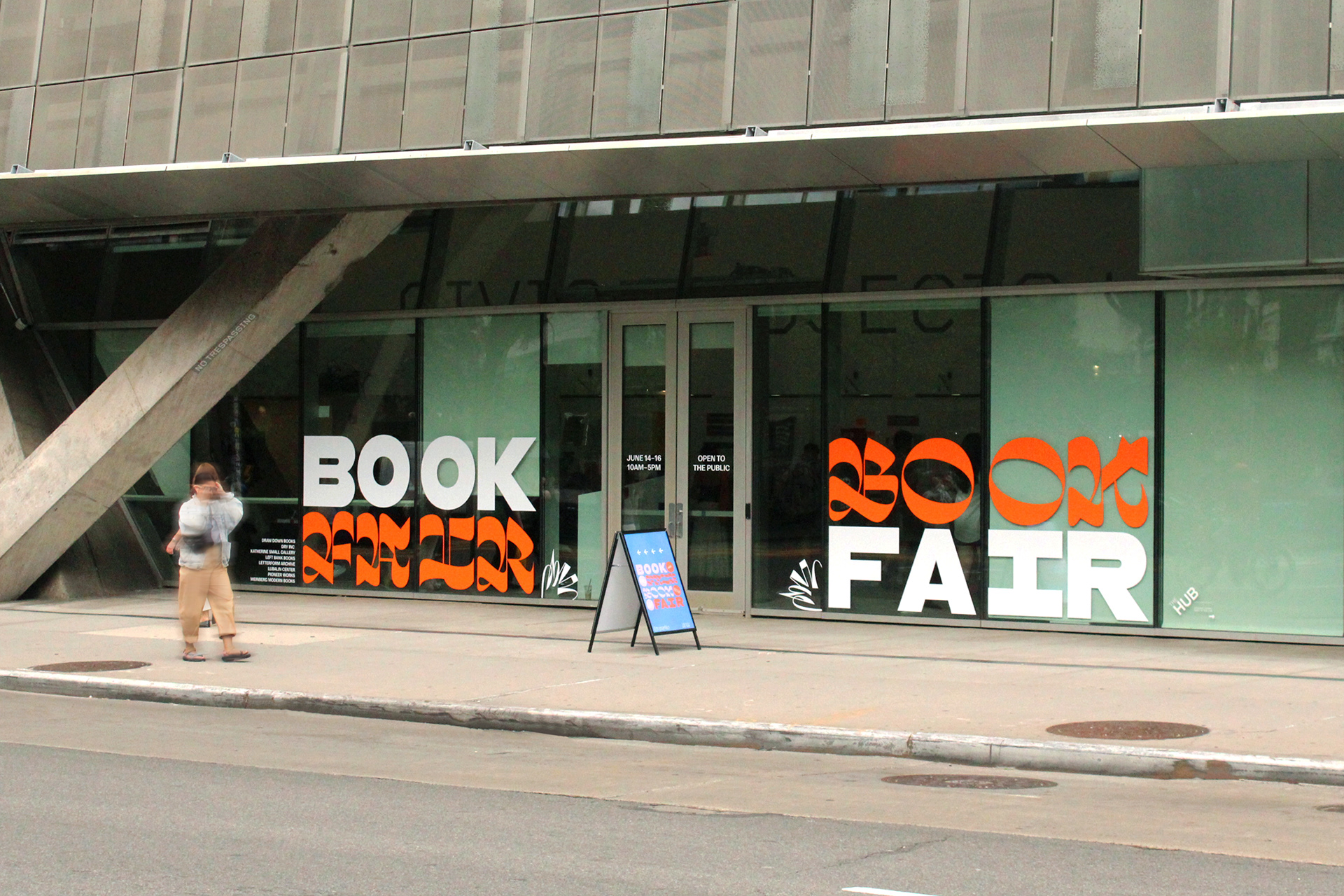
Design, Production, and Instillation: Lily Nguyen
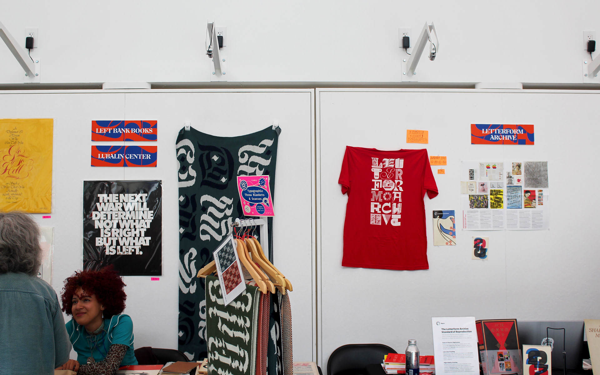
Book Seller Signs: Lily Nguyen
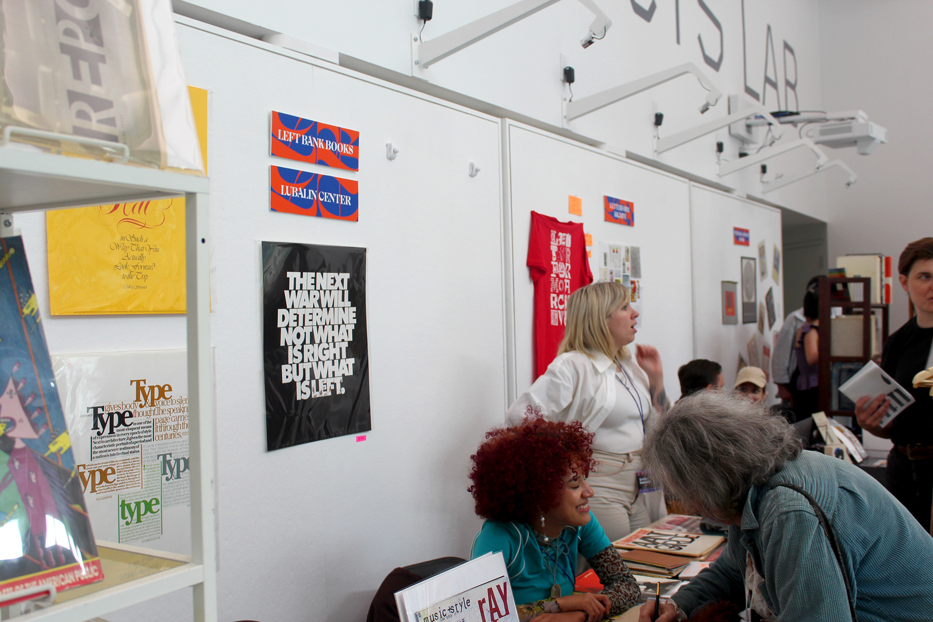
Book Seller Signs: Lily Nguyen
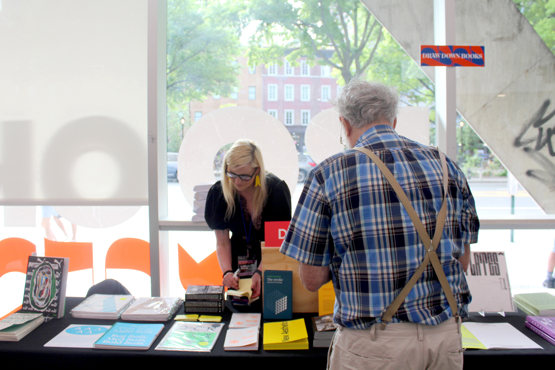
Book Seller Signs: Lily Nguyen
ALICE EXHIBITION
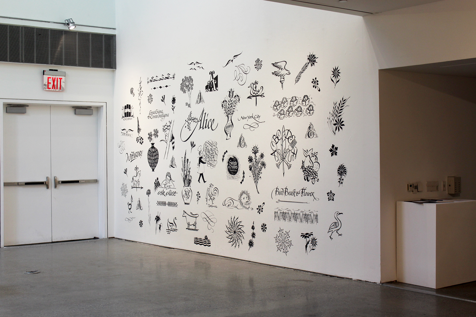
I designed a Photo-Op wall for an exhibition highlighting famous calligrapher Alice Koeth, curated by Society of Scribes as a part of Typographics 2024. Utilizing original artwork by Alice, this 10 feet tall by 20 feet wide phototex wall allows for exhibition goers to get up close and see her work in high-res detail.
This design also captures her fun spirit by hiding letters throughout the composition that spell out her name. See if you can spot them!
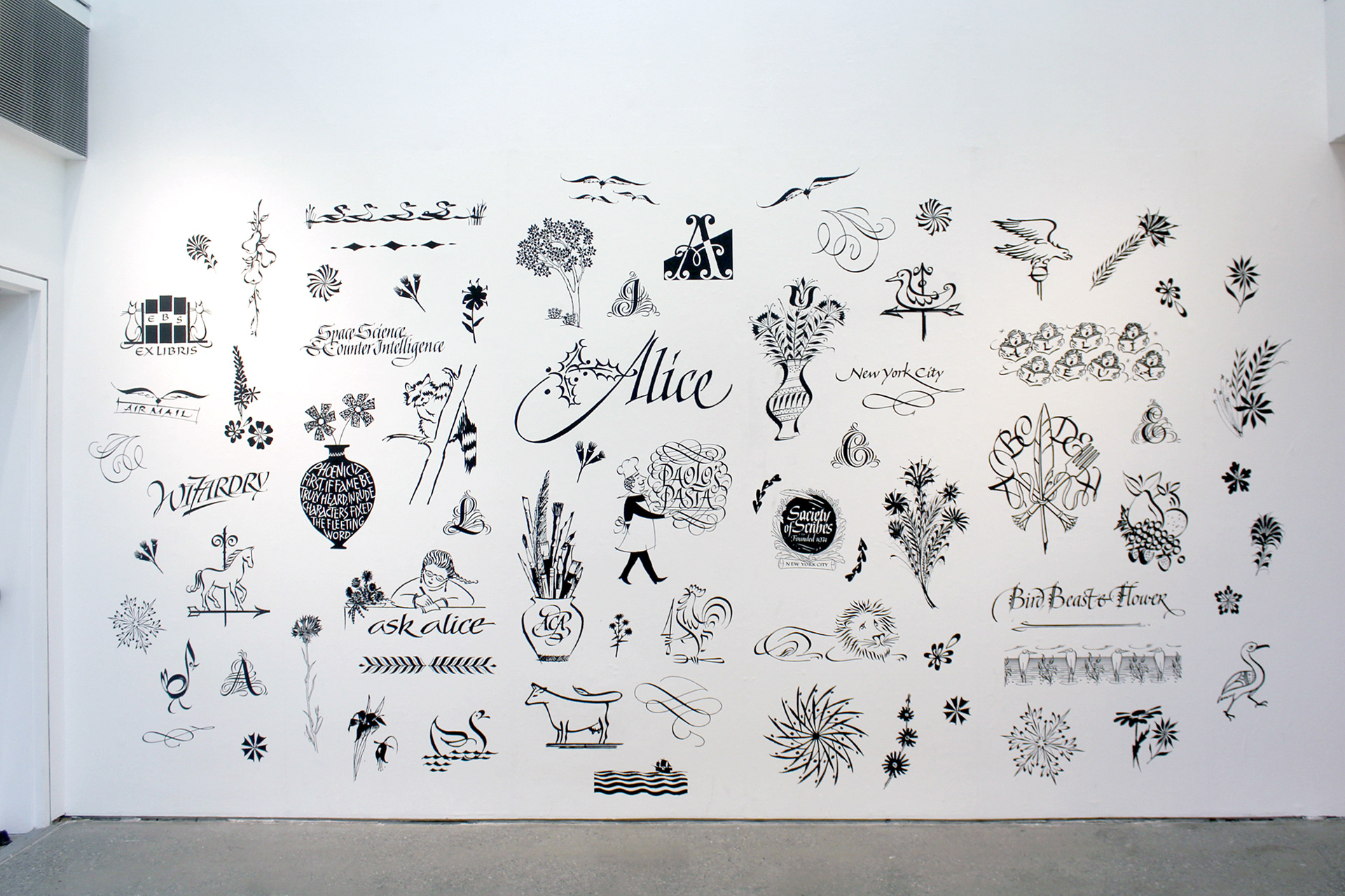
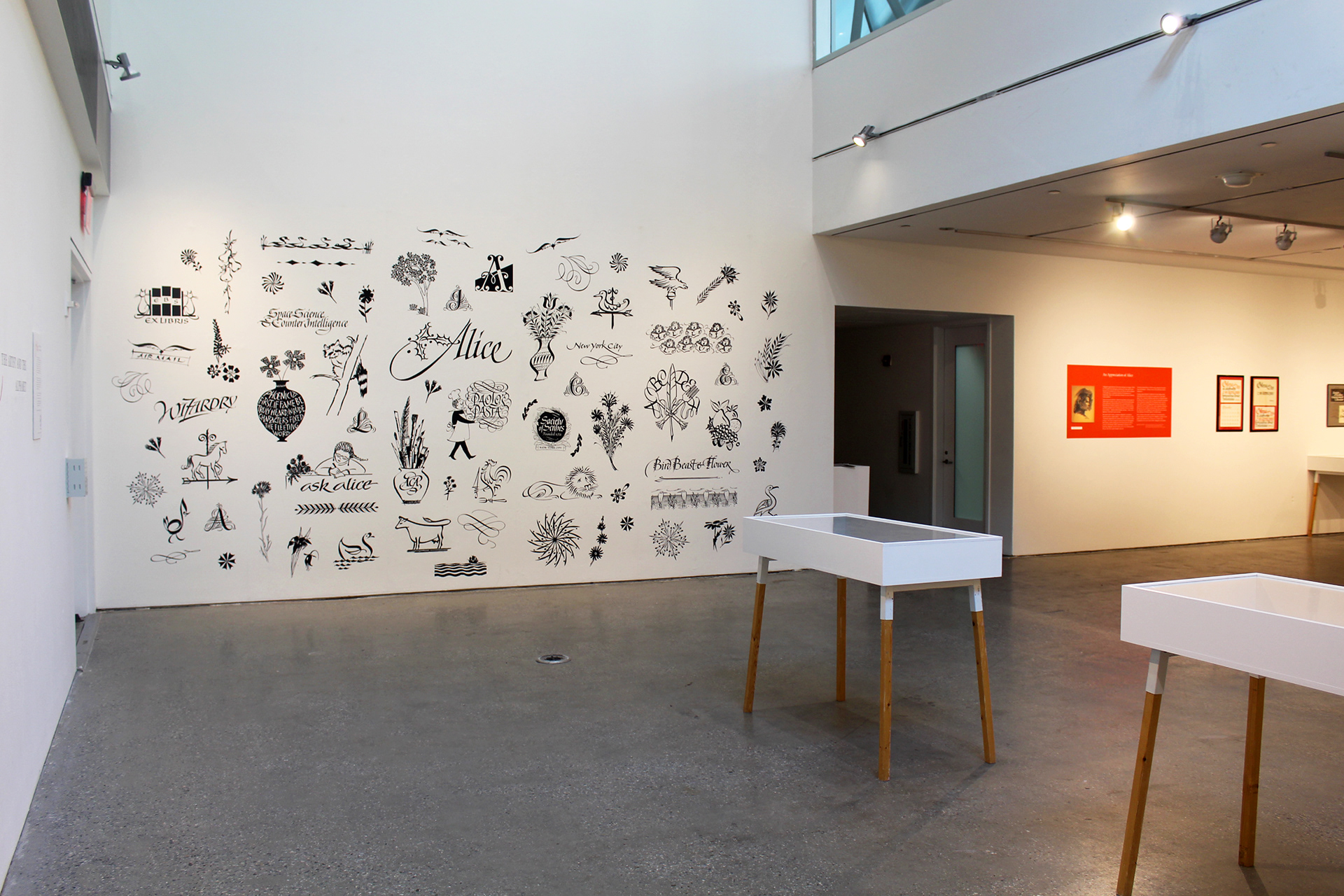
Photo-Op Wall: Lily Nguyen
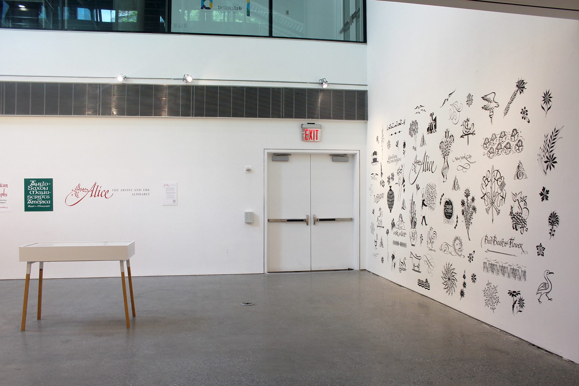
Photo-Op Wall: Lily Nguyen
